NAHREP introduced a new look in February, the organization’s first major branding change since its beginning in 1999. The new logo was primarily motivated by a general desire for “something new,” particularly encouraged by the national board of directors, according to NAHREP Co-Founder & CEO Gary Acosta. This drive for novelty is characteristic of NAHREP, as its members and leadership are continually bringing NAHREP into new markets and pushing the organization to grow.
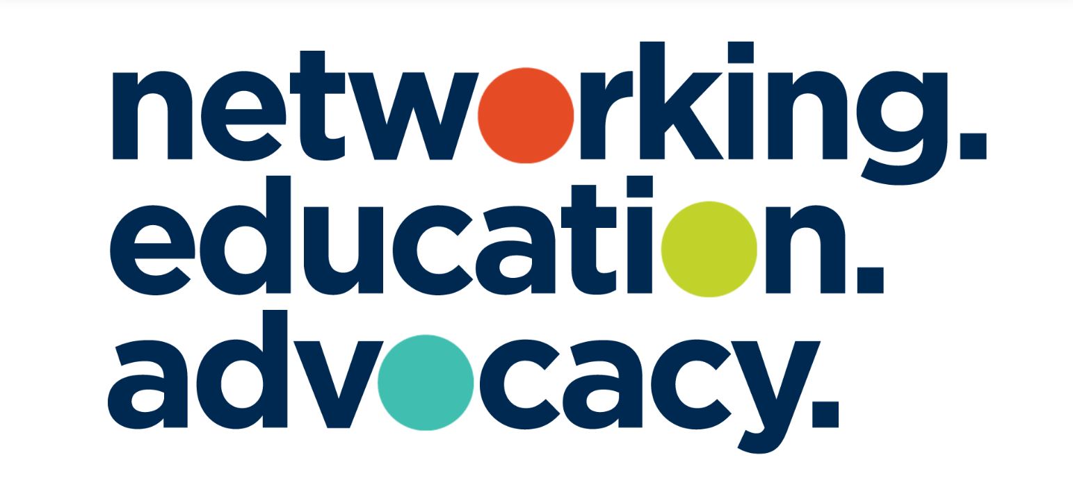
The new logo highlights the three core values of NAHREP, and especially illustrates the organization’s priority on building connections, one of its most defining characteristics. As we like to say, we’re more than a network, we’re a familia.
While the logo is an excellent representation of NAHREP, that doesn’t mean it was easy to settle on. The behind-the-scenes reality is that it took several months and around a hundred redesigns to get here. The designers considered contemporary trends and what megabrands like Starbucks have been doing lately. The team explored many different directions, so this final selected logo truly is the best of the best.